of advisors who started onboarding never activated
The Android app could not capture KYC or bank details at all. Every signup routed through a field leader on desktop, so activation waited on someone else’s calendar.
Case study · RB Partners
100,000 insurance advisors run their income off this platform. Onboarding stalled, renewals sat unseen, and one in five advisors phoned support for tasks the portal already handled.
Project overview
A partner referral incentive launched in month two, so the onboarding lift is not attributable to design alone. The renewal, support and library figures had no competing launch in their measurement windows.
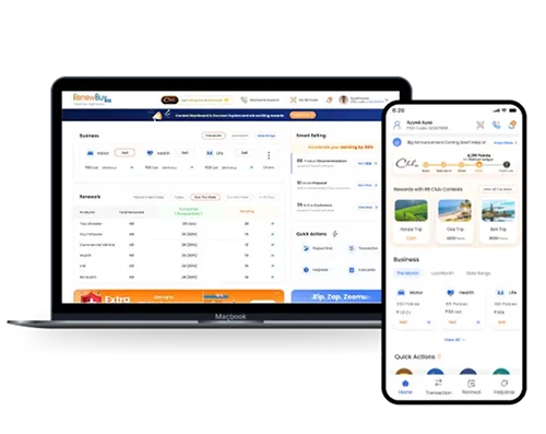
RB Partners is RenewBuy's platform for independent insurance advisors. They onboard onto it, sell policies across multiple insurers, chase renewals, share collateral with customers, and track their own payouts. For most of them it is the only tool between them and their commission.
I joined the product after two years of feature stacking. Nothing on the platform was broken. Everything on it was hard to find, and advisors had learned to phone a human instead.
KYC and bank verification are IRDAI-mandated. Steps could be resequenced, never removed.
The desktop portal could not be deprecated. Field leaders still onboarded advisors on it daily.
One PM, one engineering pod, Android and web. No dedicated research or QA resource.
Research was 12 advisor calls, 4 sessions with FLS and DST teams, and Clarity session replays.
Discovery and synthesis. Information architecture. All onboarding, renewal, dashboard and library flows. Visual design. Prototype. Dev handoff and UAT.
The partner referral incentive. KYC vendor selection. Catalogue commercial terms. Android release engineering.
Every problem below was already visible in platform data before research started. Research told us why each one was happening, not that it was happening.
The Android app could not capture KYC or bank details at all. Every signup routed through a field leader on desktop, so activation waited on someone else’s calendar.
Renewal cases sat inside the dashboard with no notification and no dedicated entry point. Most advisors learned a policy had lapsed when the customer called them.
Payouts, transactions and passbook checks were all on screen. Advisors could not find them, so they phoned a human. Support capacity was spent on navigation.
Brochures went out from personal WhatsApp folders. Outdated documents reached customers regularly, and compliance had no visibility into what was sent.
They were not abandoning the form. They were waiting for a person.
Who this is for
Onboards, sells, chases renewals, tracks payouts. For most, this is the only tool between them and their commission.
Ran every signup from a desktop. The bottleneck research found, and the reason the desktop path stayed alive after launch.
Absorbed one in five advisors asking where payouts and transactions were. Capacity spent on navigation, not on problems.
Every step that asked for a document without saying why produced a measurable drop in Clarity replays. That reframed onboarding from a form-length problem into a disclosure problem, and it is why each step now states what the document is used for before requesting it.
Advisors were not abandoning onboarding. They were waiting for an FLS to reach them. Shortening the form would have moved nothing. The fix had to remove the human dependency, which is what pushed the whole flow onto mobile.
Payouts, transactions, passbook and PRISM reports accounted for the bulk of inbound tickets. That narrowed the dashboard brief from "simplify everything" to "promote four things and demote the rest", which was buildable in the time we had.
Plum, Turtlemint Pro and Probus all completed advisor onboarding in three to four days on mobile-first KYC. None of them solved collateral distribution. That told me two things: copy the onboarding pattern rather than invent one, and treat the product library as the differentiator instead of a phase-two nice-to-have.
KYC and bank verification are IRDAI-mandated. The Android app could capture neither, so field leaders ran every signup from a desktop.
Full mobile flow with PAN and Aadhaar auto-fill and penny-drop verification. Each step states which document it needs and why before asking.
Field leaders lost the bulk-onboarding view. We kept the desktop path alive for two quarters, so two flows and two sets of edge cases.
Renewals span every line of business, and the dashboard already carried eleven competing sections, with no notification and no destination.
A bottom-nav destination, a dashboard renewal table, and a renewal customer list, with staged notifications for both user groups.
A fifth item in the bottom nav, against the usual advice to hold it at four. We paid for the slot by demoting Helpdesk to a header icon.
Advisors used the dashboard for four things and hunted for all of them, then called support when the hunt failed. Eleven sections competed for one screen.
Transactions, Payouts, Passbook and PRISM reports into a fixed quick-action row. The rest into a searchable secondary sheet, plus a smart-selling module.
Less-used insurer tools lost home-screen visibility, at under 4% weekly usage. Search kept the demotion from becoming a disappearance.
Brochures went out from personal WhatsApp folders. Outdated versions reached customers and compliance had no visibility into what was being sent.
A product library filtered by insurer, line of business and category, with sharing wired to the library rather than the device.
No custom collateral, which several top sellers asked for. Compliance exposure outweighed personalisation, so those requests went to a later phase.
Handoff and UAT
Impact
| Metric | Before | After | Window | How it was measured |
|---|---|---|---|---|
| Onboarding completion | 56% | 77%+21 pts · +37% relative | 3 months | Platform funnel analytics, all-India advisor base, post-UAT rollout |
| Renewal case engagement | 61% | 72%+11 pts · +18% relative | 2 months | Renewal cases actioned as a share of cases due, all lines of business |
| Dashboard engagement | Baseline | +35% | 3 months | Weekly sessions touching the promoted quick actions |
| Support tickets, basic tasks | Baseline | −60% | 3 months | Ticket volume for payout, transaction and passbook queries |
| Product library adoption | 0 | 65% | 3 months | Share of active advisors opening the library at least weekly |
Platform analytics and internal support dashboards, rounded to whole points, measured against the pre-launch baseline for the same cohort. Rollout followed UAT with advisors and two rounds of fixes. A partner referral incentive launched in month two, so I do not claim the onboarding lift as design-only. The renewal, support and library figures had no competing launch in their windows.
A second user group inside the same flow. Discovering it late forced us to keep the desktop path alive and cost two sprints. I now map every role that touches a flow before scoping, not after the first prototype.
We know 65% of advisors open it. We do not know which filters they use or abandon, so phase two planning is guesswork. Instrumentation is now a line in my handoff spec rather than something I assume engineering will add.
A 60% drop in ticket count reads well, but says nothing about whether the calls that remain got harder or longer. The next version of this measurement splits volume from resolution time.
Next case study

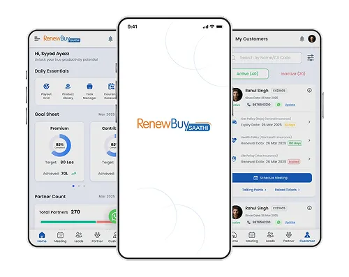
Redesigned RB Saathi App for reporting managers and supervisors. Built tracking for field sales teams productivity, lead visibility, and engagement to drive sales.
Get in touch
Open to senior product design roles in fintech and insurance (B2C, B2B, and SaaS).